HBO Asia

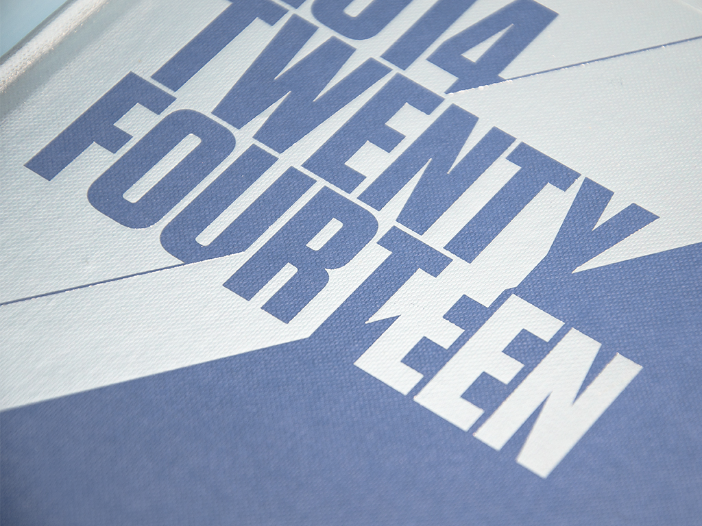
HBO Asia's 2014 brand refresh centered around the strategic use of geometric shapes and vibrant colors. This concept aimed to create a versatile identity system capable of extending seamlessly across various channels and platforms. The incorporation of geometric shapes provided both a modern and flexible foundation for the brand's visual identity.
Complementing the geometric shapes was a carefully chosen palette of vibrant colors. These hues not only added energy and dynamism to the brand but also helped differentiate content genres and elicit specific emotional responses from the audience. Each color was thoughtfully selected to enhance the viewer experience and resonate with the target audience.
The success of this brand refresh lay in its adaptability and universality. The identity system could effortlessly transition across television graphics, digital platforms, marketing materials, and more, ensuring a consistent and engaging brand presence across all touchpoints. This concept not only revitalized HBO Asia's image but also positioned it as a forward-thinking and innovative player in the competitive media industry.
I held a regional creative role responsible for HBO Originals campaigns, including the globally popular series Game of Thrones and HBO Asia Originals such as Halfworlds, Grace, and Serangoon Road. In this capacity, I was tasked with conceptualizing and executing campaigns for HBO Asia and Cinemax premium collections, as well as through-the-line movie campaigns.


