MINDEF / Digital Ops-Tech Centre - 2025
1. Overview
As Senior UX Designer, I led the end-to-end web responsive design of the tracking platform, Trackr across SAF. We made tracking readily accessible and on-the-go, automate computation to reduce time spent on manual work, easy status monitoring for ground units by consolidating a complex policy system into providing real-time updates in daily operations.
Within 12 months post-launch, the results were steadily increasing:
Final Screens Gallery


Quick Walkthrough Video
2. Context
Sephora SEA operates in six markets with different promotion mechanics, campaign calendars, and customer behaviours. Promo codes and deals drive a significant portion of revenue , yet they were also:
• Hard to discover
• Frequently invalid or ineligible
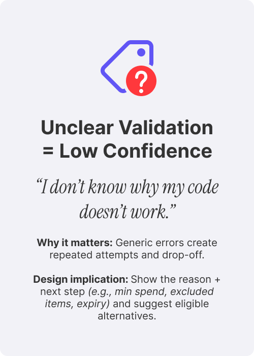
• Poorly explained with generic error messages
• Inconsistent across markets and channels
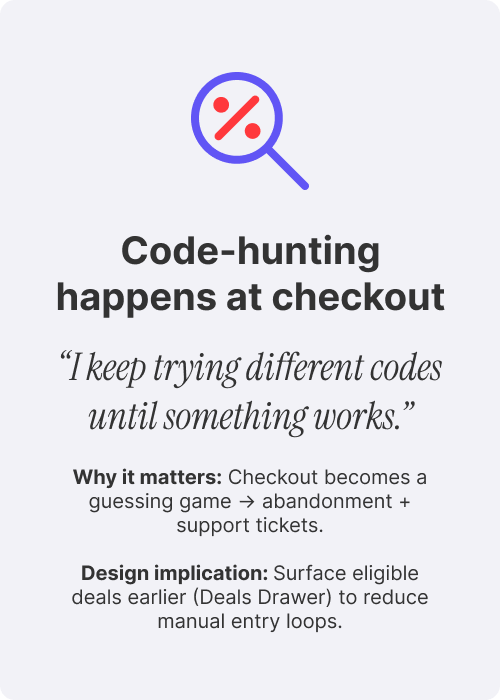
Customers often reached the checkout page, entered a code they found from email, social media or a friend, and hit a dead end, leading to repeated attempts, confusion, and abandoned carts.
Our challenge was to simplify this experience without losing the flexibility the business needed.
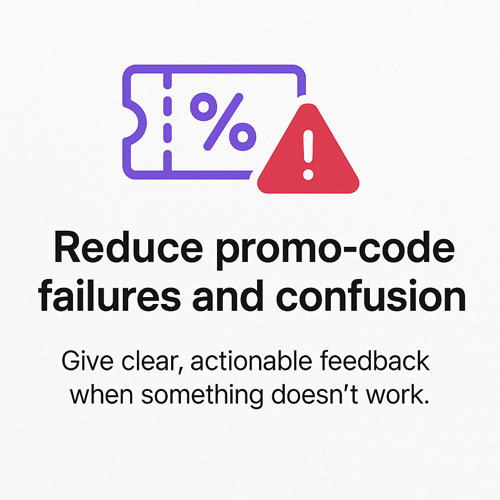
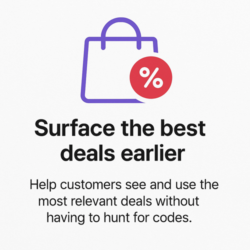
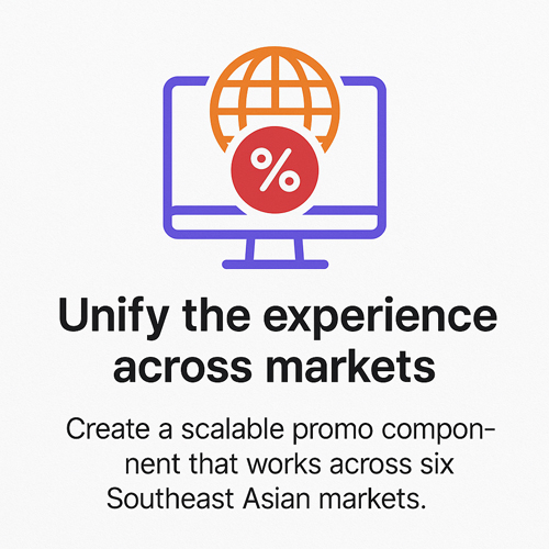
3. Goals
Together with the CRM, Product and Engineering teams, we defined three primary goals:
4. Role
I was responsible for the end-to-end promo and deals experience:
• Mapped existing promo code journeys and pain points using analytics and customer support data
• Led qualitative research with frequent Beauty Pass customers and high-intent promo seekers
• Redefined the journey from discovery to checkout, including validation, eligibility, and error handling
• Designed the Deals Drawer, inline validation patterns, and auto-apply logic
• Partnered with product, CRM, engineering, and regional marketing to align on rules, content, and rollout
• Built scalable components and interaction patterns reusable across all markets
This work became a core pillar of the broader “Deals For You” personalization initiative.
5. Research & Insights
5.1. Desk Research — Competitive & Comparative Analysis1
1 Asos, Shopee, Lazada, Adore Beauty, Cult Beauty, Look Fantastic, David Jones, Tangs, Watsons, Shein, Hermo

Best Deal Highlighted

Eligibility Messaging

Auto-apply

Ability to Switch Deals
What we reviewed
• Regional e-commerce and marketplace promo patterns (how they surface, validate, and resolve deals)
• Common mechanics: auto-apply vs manual codes, stacked discounts, tiered spend, loyalty perks
Key takeaway
• Best-in-class experiences reduce “code-hunting” by surfacing eligible deals earlier and making discount logic transparent (especially at bag/checkout).
5.2. Foundational Research — User Interviews
Who & What we heard
• Frequent Beauty Pass shoppers + high-intent promo users (across multiple SEA markets)
5.3 User personas help us design for real needs—not assumptions

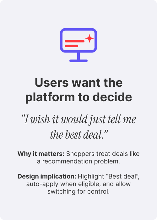
Persona A: The Deal Hunter
Goal: maximise savings, uses codes from multiple channels
Pain: keeps testing codes, low trust when it fails
Needs: “best deal surfaced” + transparent rules
“When I’m checking out, I want to know the best discount I qualify for, so I can finish confidently.”

Persona B: The Busy Repeat Shopper
Goal: quick checkout, expects loyalty benefits to “just work”
Pain: promo complexity slows down purchase
Needs: auto-applied deals + minimal friction
"I believe that quality doesn't have to come at a high cost. With the right discounts and promo codes, I can enjoy premium beauty products without compromising my budget."
6. Strategy
We aligned on these guiding principles which acted as the compass through design and implementation:

We also worked within key constraints:
• Support market-specific promo rules without fragmenting the UX
• Keep copy clear across regions, languages, and campaign types
• Build reusable, configurable components for engineering
• Give CRM flexibility to launch new deals quickly
7. Design
7.1. Deals Drawer
Surfacing deals earlier, helping shoppers make smarter purchase decisions
We introduced a Deals Drawer across homepage, product catalog, and checkout that:
• Shows eligible deals in one place
• Highlights the best available promotion
• Displays progress for tiered discounts (e.g. “Spend $20 more to unlock 15% off”)
• Reduces reliance on manually hunting codes across channels
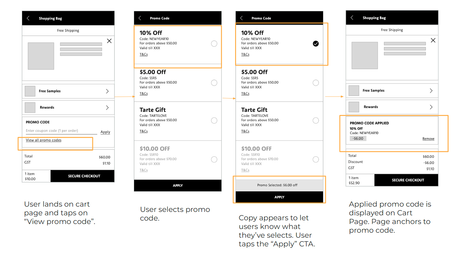
7.2. Smarter Promo Code Field
A smarter promo field with inline validation
We upgraded the promo input from a basic text box into a guided component that:
• Validates codes in real time
• Uses clear success / warning / error states
• Explains exactly why a code doesn’t work (expired, minimum spend not met, excluded categories, etc.)
This reduced guesswork and helped shoppers recover quickly.
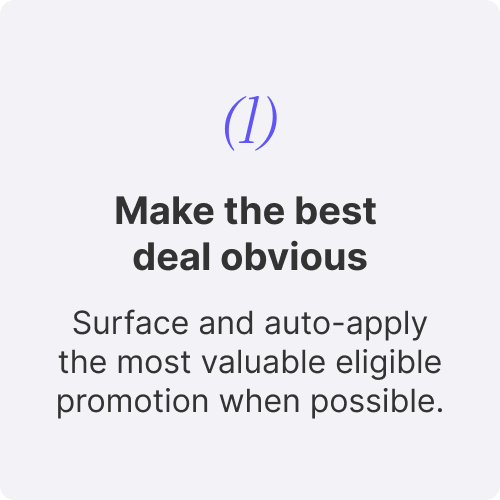
7.3. Auto-apply the Best Deal
Automatically applying the best available promotion
When multiple promotions were eligible, the system now:
• Checks all available deals
• Selects the best option based on discount logic
• Applies it automatically while allowing users to switch if they prefer another offer
This prevents missed savings and builds trust in the platform.
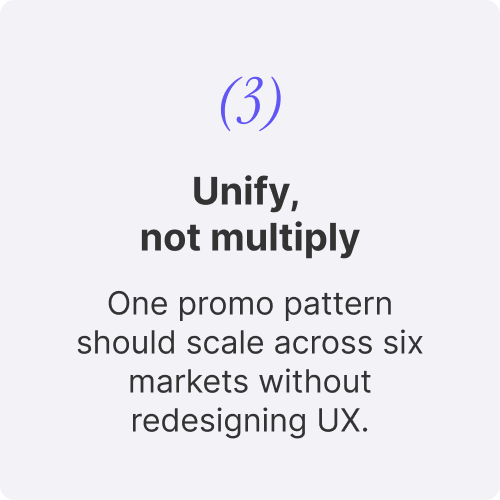
7.4. Multi-market Component System
A unified component system across six markets
We designed the promo experience as reusable components:
• Flexible for different rules and languages
• Consistent in layout, copy patterns, and interaction behaviour
• Faster for engineering and CRM teams to roll out campaigns without reworking UX market by market
This reduced operational overhead and improved long-term maintainability.
8. Usability Testing
We ran usability sessions with Beauty Pass members across multiple markets.

Overall testing showed:
• Higher confidence applying promotions at checkout
• Fewer repeated attempts with invalid codes
• Clear understanding of eligibility rules and tier progress (“spend more to unlock…”)
• Positive feedback on seeing all deals in one place with clearer explanations
1. We asked if new promo code & deals design is easy to find.

2. We also asked if they can differeniate between eligible and non-eligible promos.

9. Outcomes & Impact
While specific metrics are confidential, post-launch we observed:
• A clear drop in failed promo-code attempts
• Improved checkout completion among users interacting with promotions
• Higher average order value in markets running tiered spend promotions
• Fewer customer support tickets related to “invalid” codes
• Stronger operational consistency with a shared promo UX pattern
10. Reflections & Next Steps
With another iteration cycle, I would explore:
• Making Beauty Pass loyalty tiers more prominent within the deals experience
• A dedicated “My Deals” hub to save and track offers
• Predictive deal suggestions based on browsing and purchase behaviour
This project reinforced the value of pairing business flexibility with straightforward, human-centered communication—especially in complex discount systems.
Senior Product Designer (Public Sector / Defense Tech) | Product Storytelling, Brand & Strategic Comms | UX Strategy, Service Design, Stakeholder Engagement