Ministry of Culture, Community & Youth - 2017
1. Overview
Singapore’s social support ecosystem spans multiple agencies and schemes, but citizens often struggled to know where to start, understand eligibility, and navigate policy-heavy content. I led the end-to-end redesign of the Social Grants Portal for both applicants and processing officers—consolidating information, guiding eligibility in plain language, and reducing application anxiety across mobile, desktop, and assisted journeys.
Agency: Ministry of Culture, Community & Youth (MCCY)
Role: UX / Product Designer
Impact Highlights (Metrics redacted; outcomes represented qualitatively)
1. Shorter completion time led to more and accurate submissions.
2. Applicants described the experience as seamless and said they’d recommend it to others.
2. Guided questions reduced “wasted applications” and improved approval success rates.
3. The portal became a stronger conversation tool during assisted journeys and helped officers process grants more efficiently.
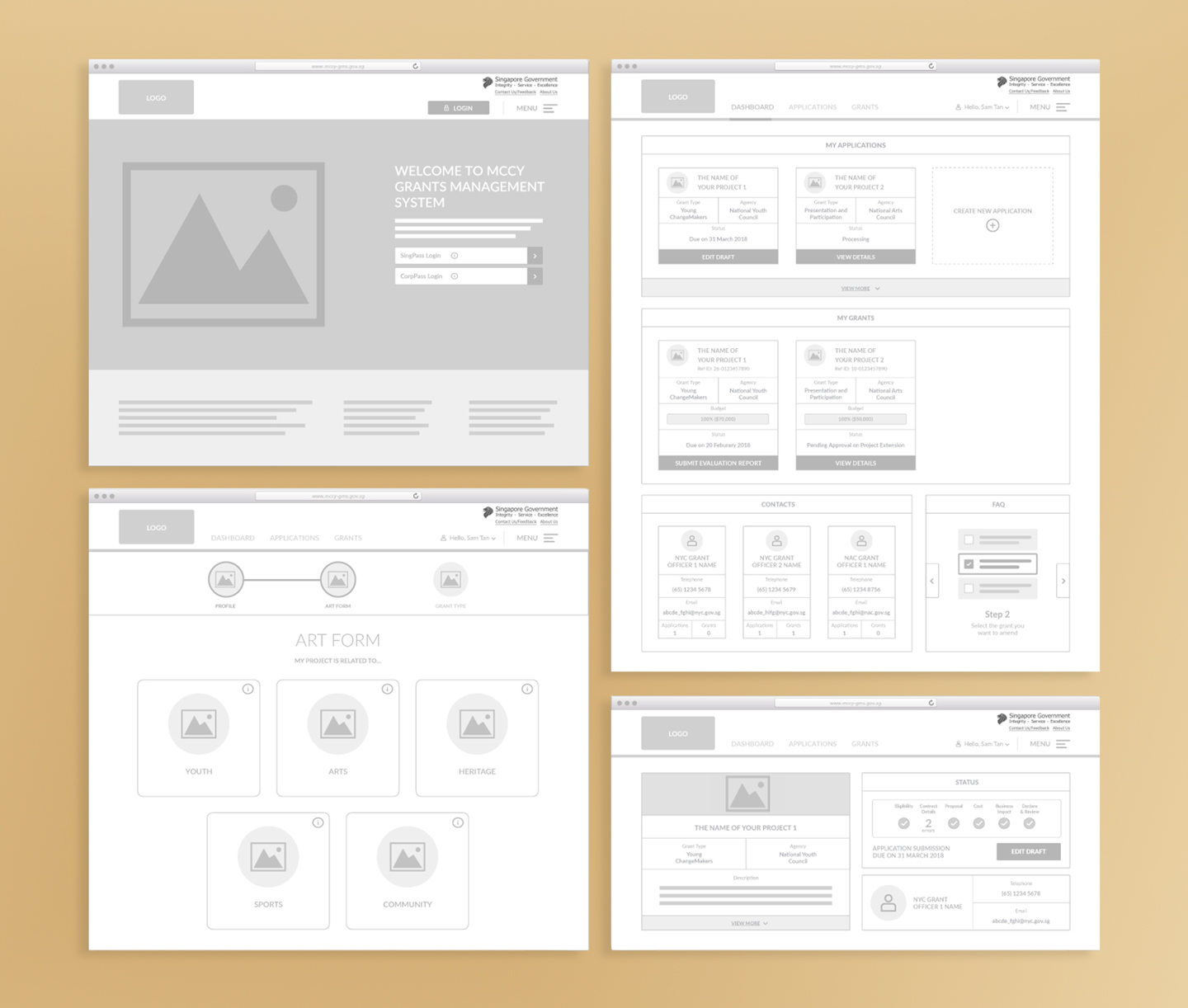
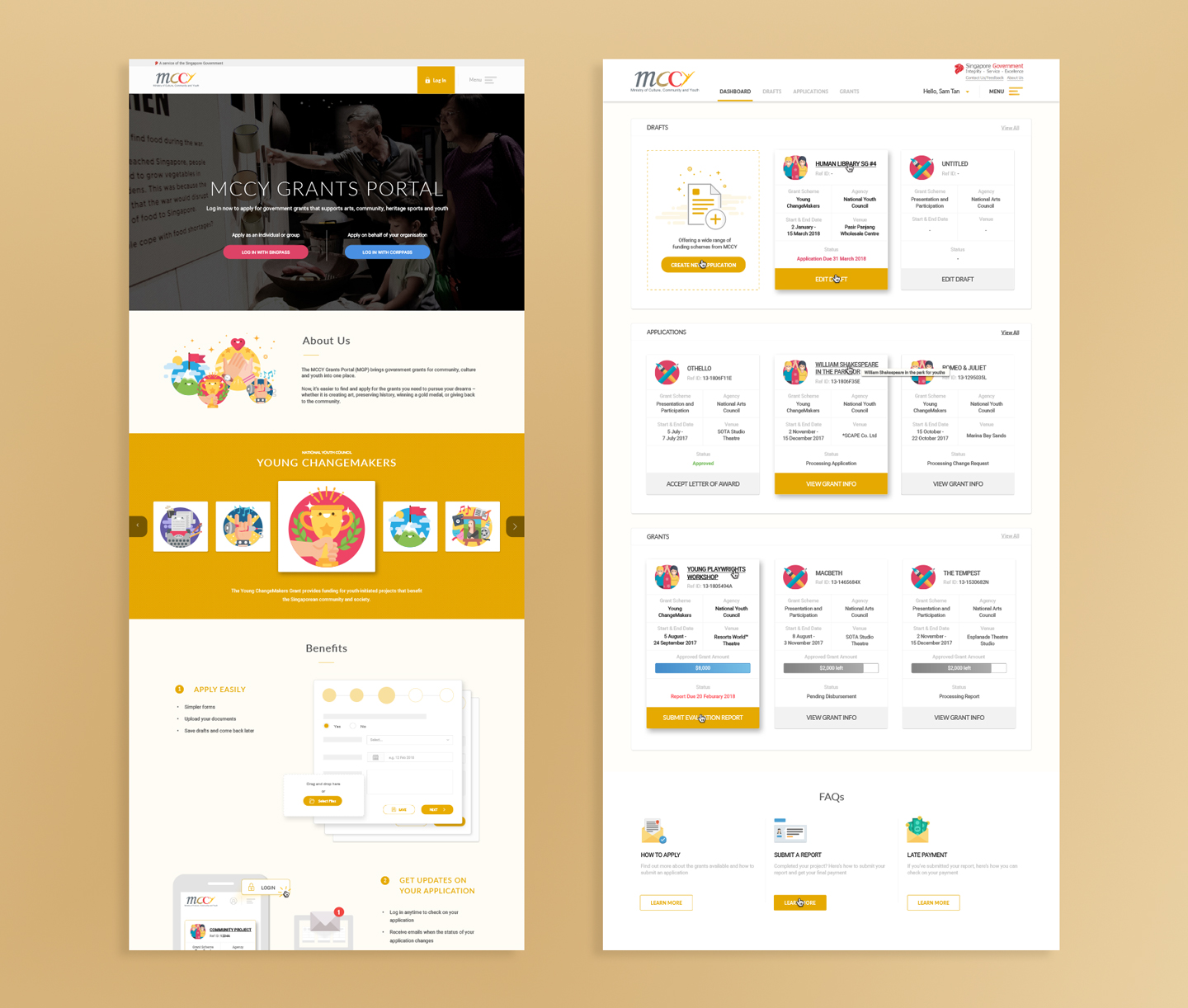
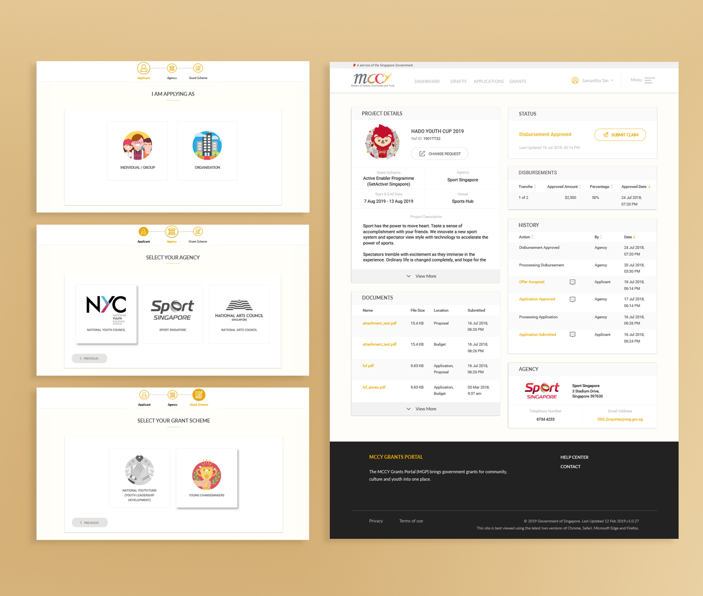
Final Screens & Illustrations Gallery
Quick Walkthrough Video (Rebranded as OurSG Grants Portal during 2022)

2. Context
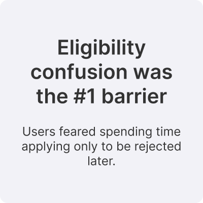
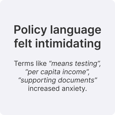
Pain points (Applicants)
• Unclear criteria/next steps and repetitive forms
• Inconsistent, officer-dependent process with slow clarifications and weak reminders
• Uncertain grant amounts and delayed disbursement, making budgeting hard (esp. non-profits)
• Digital/soft-copy documents should be the default
Pain points (Processing Officers)
• Long, tedious process with manual, error-prone tracking that distracts from higher-value work
• Reporting and data analysis are time-consuming
• Lack of automated notifications/reminders causes follow-ups and missed actions
• Cross-agency work is fragmented—limited sharing, no unified view of total support, inconsistent practices across MCCY grants
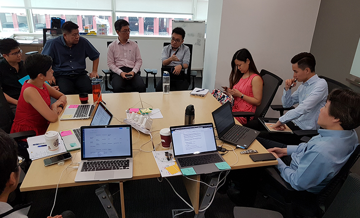
3. Role (and collaborators)
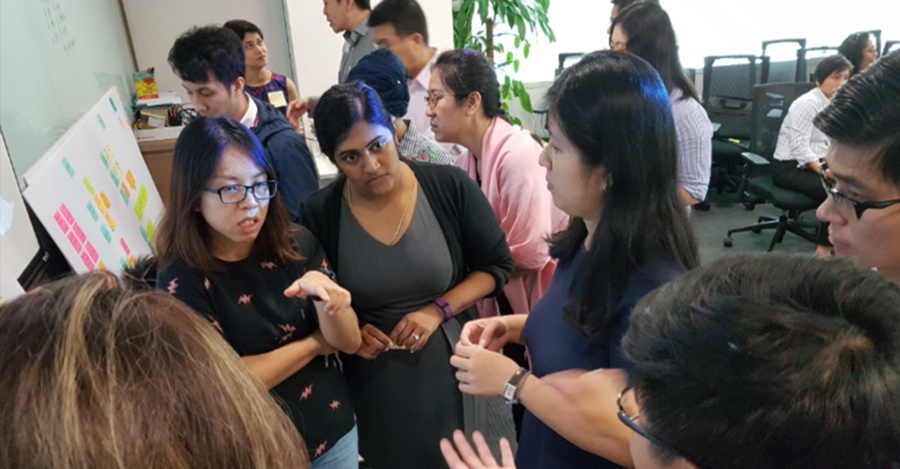
• Field and user research with citizens and community partners
• Journey mapping and synthesis of grant-seeking behaviours
• Designing life-situation navigation and an eligibility helper tool
• Content structuring + plain-language rewrites (with policy verification)
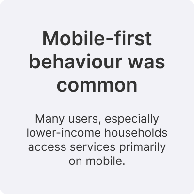
• Responsive UI and mobile-first interaction patterns
• Visual branding, iconography system, and UI consistency
• Supporting UAT and frontline/onboarding enablement
Design constraint (core challenge):
Balancing policy accuracy with human readability—without introducing ambiguity or misinterpretation.
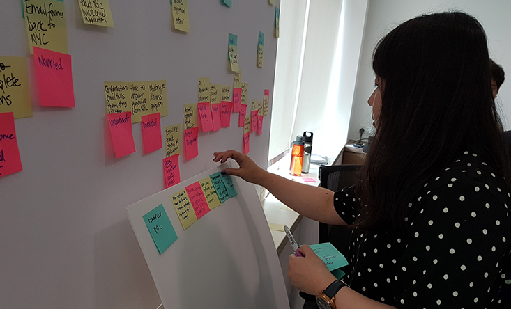
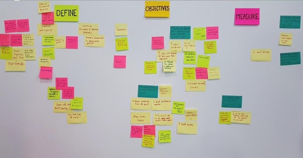
4. Research & Insights
What we did:
• Interviews with citizens across different life situations
• Sessions with social workers and community partners
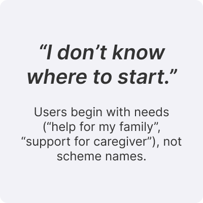
• Observations of how people search for grants online (e.g., keywords vs scheme names)
• Workshops with policy officers to understand end-to-end application processing
Key Findings uncovered:
5. Strategy & Principles
1. Build a user-friendly grant platform that makes application seamless and joyful:
Customer satisfaction levels, application numbers, time taken to complete application form
2. Make processing grants more efficient:
Average processing times/man-hours, average number of clarifications per application, rate of award, officer satisfaction levels
3. Enable sharing of data and best practices across MCCY family of agencies:
Number of inter-agency queries, Number of grants with a similar workflow
4. Better governance and improved accuracy in processing grants:
Number of audit findings
6. Design
What changed?
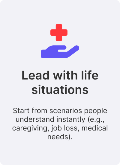
We replaced long policy description with scenario-based starting points when choosing grants.
Presentation and Participation Grant
“I’m an author working with a publisher on a new book, and I need support for production plus marketing and distribution.”
Creation Grant
“I’m an artist developing an original new work, and I need support for the creation process, research, collaborators, and prototyping over the next year.”
Enhanced Fund-Raising Programme
“I’m from a Singapore-registered charity running a time-bound fundraising campaign for a local charitable cause, and I need matching support to stretch every donation further.”
Call For Ideas Fund
“I’m a Singapore resident leading a community eco-project, and I need co-funding to kickstart an initiative that tackles a local environmental challenge through outreach and education.”
Why it worked for users?
1. Matches how users think and search for help
2. Reduces the need to interpret government terminology
3. Creates a calmer “first step” when users are already stressed
Concept:
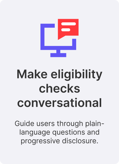
An eligibility helper that asks simple questions (one per screen) and returns a personalised list of relevant grants.
Key design decisions:
• One question per screen + clear progress indicator
• Plain-language answer options (no policy jargon)
• Privacy reassurance (what’s used, what’s not stored)
• Optional steps and gentle branching (reduce drop-off pressure)
• Results framed as “what you may qualify for” + next steps
Content structure (repeated across schemes):
• Who it’s for
• What support you’ll receive
• How to apply
• What you’ll need ready (documents + preparation)
What improved:
• Clear hierarchy replaces dense paragraphs
• Icons reinforce meaning and help scanning
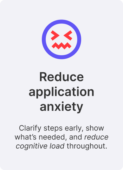
Approach:
• Group fields by meaningful tasks
• Keep screens short (max ~3–4 fields)
• Autosave + visible progress cues
• Review screen before submission
• Requirements summary shown upfront (“what you need ready”)
What improved:
• Clear hierarchy replaces dense paragraphs
• Icons and short form text reinforce meaning and help scanning. For e.g. “Small chunks of fields” · “Clear labels” · “Review before submission” · “Autosave”
7. Visual Identity
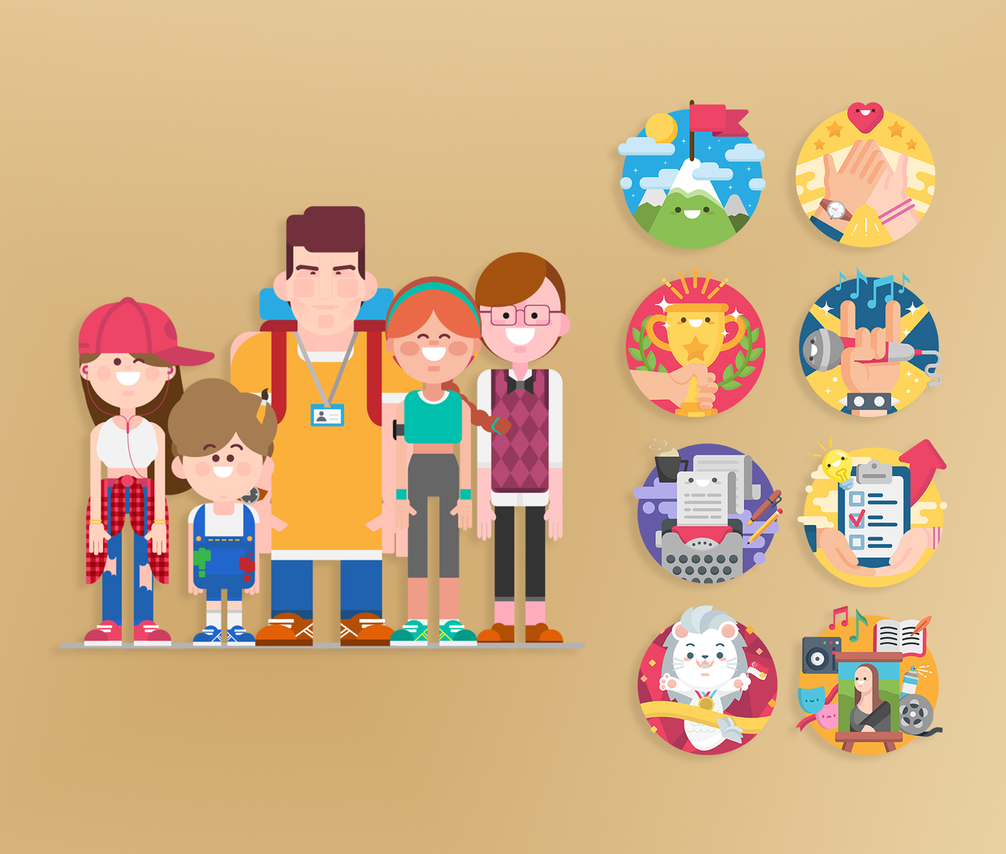
Building trust and comprehension through character-led design and consistent illustration rules:
Government portals can feel cold or intimidating especially for users already stressed about finances and eligibility. We used a warm, consistent visual identity to lower barriers, improve scannability, and make the experience feel cohesive across different grants and agencies.
To anchor the portal’s identity, I designed a set of illustrated mascots inspired by a curated mood board—created to mirror the diversity of grant applicants and their life situations.
Iteration highlights:
• Round 1 (animal personas) explored approachability—but was not well received by users/stakeholders who preferred a more humanised representation.
• Round 2 (human characters) refined the cast into recognisable archetypes (e.g., dancer, young creator, social worker, gym-goer, engineer)to better reflect real applicant profiles.
Why mascots mattered (impact):
• Humanises a policy-heavy service without sacrificing credibility
• Adds emotional safety (“this was designed for people like me”)
• Creates a consistent visual anchor across pages and states (including empty/error states)


Once the mascot style and palette were defined, we extended it systematically across the portal—so every grant icon and category visual felt like the same product family (not disconnected programmes).

What I produced:
• Illustration rules (stroke/shape language, shading, proportion)
• Colour palette + accessibility considerations
• A scalable icon system for grants and scenarios
Why this mattered (impact):
• Makes the portal feel cohesive across multiple schemes
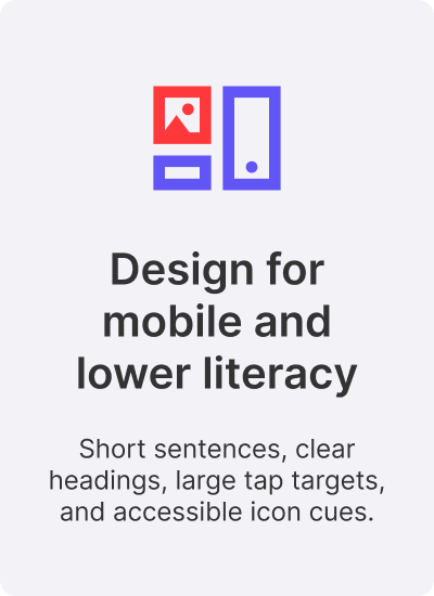
• Helps lower-literacy users identify categories faster via visuals
• Reduces cognitive load by reusing familiar visual patterns
8. Motion + Resilience
To add moments of feedback and reduce perceived wait time, I created ~three-second animated icons triggered through micro-interactions. The animations were produced in After Effects and integrated via Lottie in collaboration with another designer.
What motion did in this context:
• Adds “yes, something is happening” feedback in multi-step flows
• Creates small moments of delight without distracting from task completion
• Doubles as lightweight pre-loaders during application steps
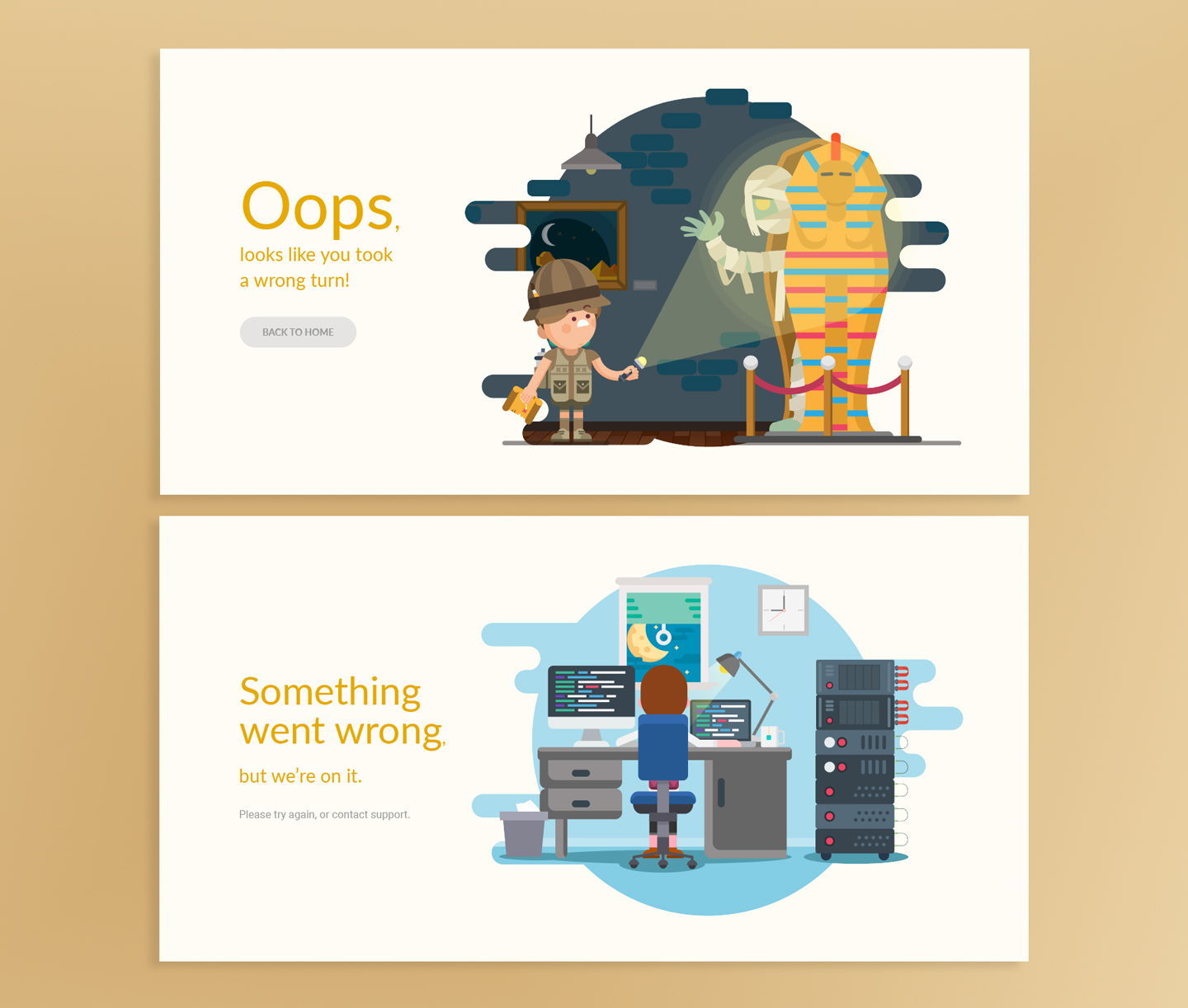
Error pages (404/500) are high-friction moments—especially when users are anxious about submitting forms correctly. Instead of dead ends, we designed error states to be:
• emotionally lighter (reduce frustration),
• directionally helpful (clear next steps),
• and still on-brand (same mascot language + tone).
Approach:
• Built a small inspiration moodboard for playful error-page patterns
• Created unique scenes starring the mascot cast, paired with friendly, guiding copy
• Doubles as lightweight pre-loaders during application steps

Error pages used:
404 - Kieron’s “wrong turn” museum adventure (supports the “wrong URL path” meaning)

500 - Philp troubleshooting late-night server issues; copy reassures users and suggests retry/support as next actions

9. Testing & Feedback
What we observed:
• Users understood life-situation cards much faster than scheme lists
• Eligibility helper reduced fear of “wasting time”
• Scheme pages were significantly easier to scan and interpret
• Mobile flows improved completion confidence
• Community partners could guide users more efficiently
.png)
Ms Tania, a freelance Artist & Writer and grant applicant since 2009
• Past Platform reliability: “I get logged out and nothing saves—I had to keep saving drafts.”
• Usability expectation of new system: “Warn me if I’m ineligible, but let me continue the form.”
• Overall appeal of prototype: “Visually, this is way better than any government site I’ve seen… 20 out of 10.”
10. Reflections & Next Steps
Key learnings:
• Human-first language is non-negotiable in government services
• Designing for lower literacy improves clarity for everyone
• Service alignment across stakeholders is as critical as UI quality
If I had another iteration cycle:
• Save grants for later + resume journeys across devices
• Tools to manage and track multiple applications efficiently
• Personalised recommendations using household profiles